ShopDreamUp AI ArtDreamUp
Deviation Actions

Private collection, please do not unlock
private drawings such as sketches, portraits and various handmade drawings. Due to the fact that it is not possible to hide folders, I decided to use this form of collecting my works
$100/month


Suggested Deviants


Suggested Collections


You Might Like…


Featured in Groups
Description
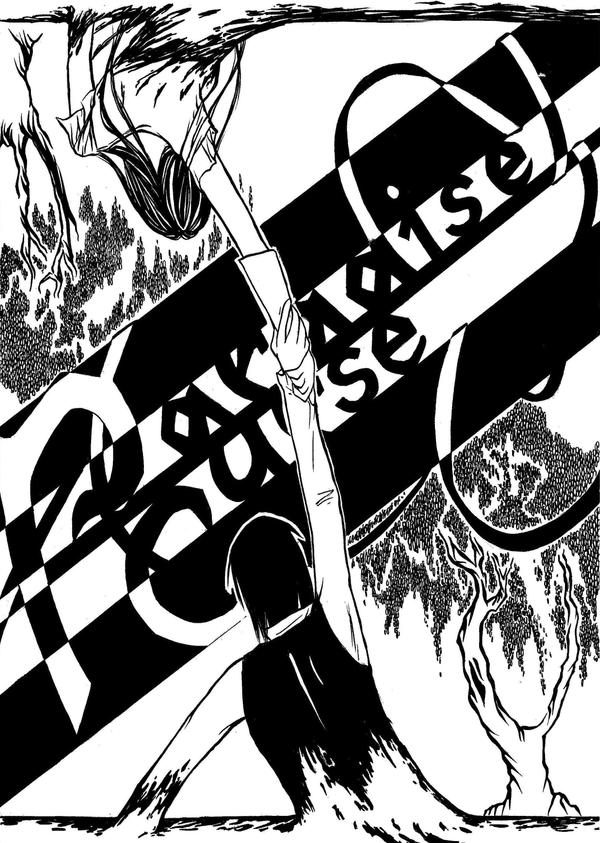
It was so easy to do this and still it's one of my favorites yet. It kinda poured out of my hand.
First I sketched some conceptual pictures with Roux keeping Zora from falling or both free-falling. I did like how these hands were holding eachother so I copied them onto the middle of a seperate new sheet and then the picture started to unfold around that focus.
I tried to make the letter's of the title as similar as I could, though it's not perfect. Same goes for Roux fingers.
Intention: Both, Zora & Roux are trying to pull eachother out of...
Lost Fragment -
Next: [link]
Previous: [link]
Image size
2476x3476px 1.19 MB
© 2010 - 2024 BlueVagabond
Comments32
Join the community to add your comment. Already a deviant? Log In
I love the symmetry you have here very much. I can feel that they are pulling each other out, but also that they are being sucked in each of their perceived pit.
It looks a lot like a woodcut in that it's both colourless and in the texture. The gothic font you've made helps making that impression too. By the way, I love how you did that, how the shapes blend into each other and how you took advantage of the duotone. Also the trees - amazing.
If I had to say something negative, it'd be about the anatomy of the figure below. His shoulder blades and arm position leaves me a little confused. Also there's a great deal of detail on the clothes and hair of the figure above but not on the one below, or their joined hands.
On behalf of #ProjectComment